"THINK OF IT LESS AS A KITCHEN, MORE OF A ROOM."
- Nate McBride
Principal McBride Architects
New York, New York
Designed by: Eliza Harris
Photographed by: Read McKendree
Stylist: Mieke ten Have
Many times, kitchens are our most used “living rooms", so they should be treated as such. My parents' kitchen in their new house in Connecticut is a perfect example of taking a barebones kitchen and making it a well-used " living room." Here is how we got the look we were aiming for.


Pick a Starting Point
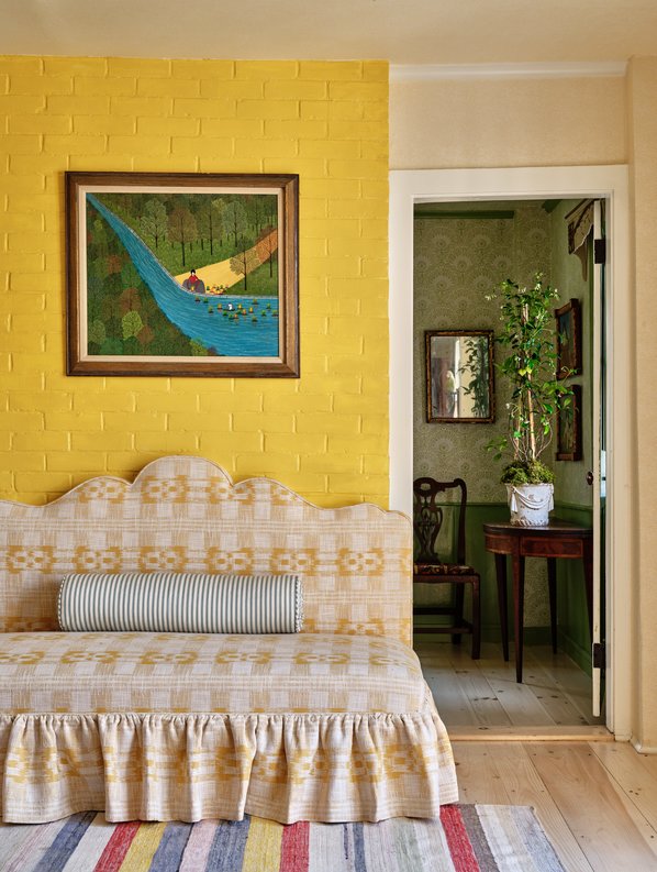
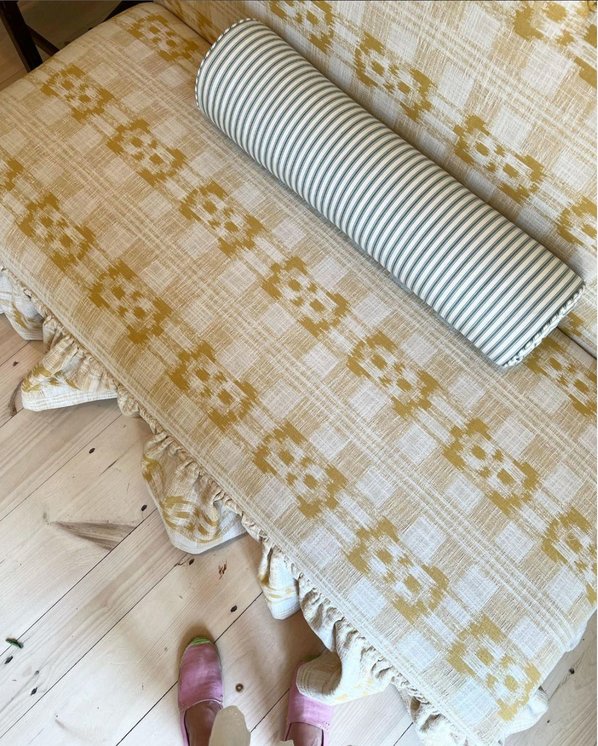
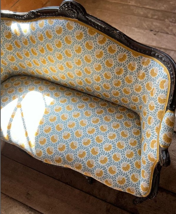
As a starting point, I wanted to bring in upholstered furniture for lounging and give it that living room vibe. I incorporated our Mahalo Performance Fabric in Gold on a beautifully shaped custom bench that will happily seat guests, kids, dogs, or just provide a cozy nook to flip through a cookbook or to take off your boots. For contrast, we also brought in an “ important” piece of furniture, a settee that had been in my great great grandparent's house. We upholstered it in one of our new coordinating colors for our much-loved Verbena in Blue & Saffron. Combined with the counter stools upholstered in Hudson in Green, there are multiple places to sit in all corners of the room.
Play with Light
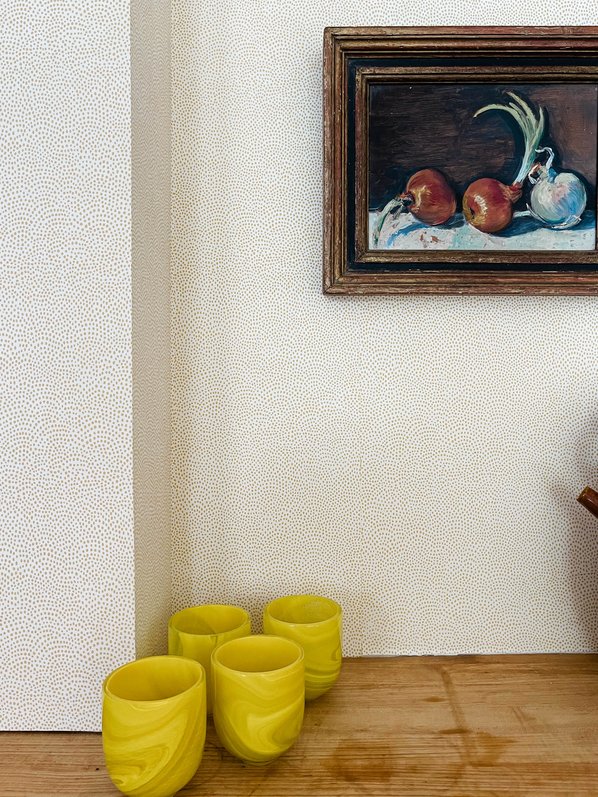
This kitchen is filled with light and is a very happy inviting space without any decoration at all so I decided to bring even more sunlight in by adding our subtle textural Dot All Over wallpaper in Wheat, which comes out this fall. I covered the ceiling and walls with it and it adds a soothing warmth all year round. I also love a beautiful chandelier because a lot of meals tend to happen on a kitchen island or table so the chandelier adds a sense of importance and festiveness and , again, provides the feeling of a real living room vs a strictly utilitarian cold room with expensive appliances and a breakfast nook!
Because the kitchen has a lot of light and great windows, I highlighted them without impeding the sunlight by adding café curtains made out of our sheer fabric in Burmese in Wheat.


Allocate your Prints
Textiles Used:
Eliza used Dot All Over Wallpaper in Wheat for the walls, Burmese Sheer in Wheat for the cafe curtains, Mahalo in Gold for the custom bench, and Verbena in Blue & Saffron for the sette.
Once you’ve landed on the fabrics and wallpapers you adore, assign them to different pieces and places in the room. Begin to pick the spots where you want all of these fabrics to go.
Reupholster a Piece of Furniture you Love
Fabric Used:
Eliza used 9 yards of Verbena in Blue & Saffron. For the trim she used a 9/16" wide tape trim.
As previously mentioned, Eliza reupholstered this vintage sette that her great-grandmother once owned. Reupholstering the sette gave it a new life and created another seating area.


